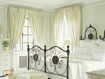
Color in curtain fabric is composed of three fundamental elements: hue, value, and saturation. These elements determine how a color appears and how it affects the viewer emotionally and visually.
Hue refers to the actual name of the color, such as red, blue, or green. It is what distinguishes one color from another. For example, mixing red and yellow creates orange, while blue and red make purple. These combinations help expand the range of available hues.
Saturation, also known as chroma, refers to the intensity or purity of a color. The higher the saturation, the more vivid and striking the color appears. A highly saturated color feels bold and lively, while a desaturated one seems muted and calm.
Value, or lightness, describes how light or dark a color is. In achromatic colors, value ranges from white (lightest) to black (darkest). Among colored hues, yellow has the highest value, while blue has the lowest. This means yellow appears brighter and more energetic than blue.

In theory, colors can be divided into two groups: achromatic (white, gray, black) and chromatic (red, orange, yellow, green, etc.). Achromatic colors are neutral and do not carry strong emotional associations, while chromatic colors are vibrant and expressive.
From a psychological perspective, colors can be categorized into warm, cool, and neutral tones. Warm colors like red, orange, and yellow evoke energy and warmth, while cool colors such as blue, green, and blue-violet bring a sense of calm and relaxation. Neutral colors like beige, gray, and some shades of green and purple offer balance and sophistication.
The psychological impact of curtain fabric colors is powerful. They influence mood, behavior, and perception through visual stimulation. Understanding these effects helps in choosing the right color for different spaces and purposes.
Red is a highly stimulating color that evokes feelings of energy, passion, and excitement. It’s often associated with love, danger, and power. In traditional culture, red symbolizes good fortune and celebration. However, it can also create tension or discomfort if used in excess. When paired with other colors:
1. Red on yellow appears more subdued and controlled. 2. Red on dark red calms the intensity and brings a sense of stability. 3. Red on lilac makes the red less dominant, allowing the lilac to take center stage. 4. Red on yellow-green adds vibrancy and interest. 5. Red on orange can feel dull and lifeless. 6. Red on black amplifies its intensity, creating a powerful and passionate effect.
Orange is a warm and energetic color, blending the brightness of yellow with the intensity of red. It is often linked to creativity, warmth, and enthusiasm. It's commonly found in nature, such as in ripe fruits, and can stimulate appetite. When combined with other colors:
1. Orange on white looks pale and weak. 2. Orange on black stands out strongly. 3. Faded orange loses its vibrancy. 4. Darker oranges provide maximum warmth and visual impact.
Yellow is a cheerful and attention-grabbing color, representing optimism, energy, and clarity. It has a high visibility and can brighten up a space. When paired with other colors:
1. Yellow on white appears dim and lacks contrast. 2. Yellow on light pink may seem washed out. 3. Yellow on orange becomes more noble and refined. 4. Yellow on green enhances brightness and vibrancy. 5. Yellow on red or purple creates a strong and balanced contrast. 6. Yellow on black is extremely bright and eye-catching, like sunlight.
Green is a calming and refreshing color, often associated with nature, growth, and balance. It combines the energy of yellow with the calm of blue. Green can evoke feelings of peace, renewal, and harmony. When used with other colors:
1. Green on yellow creates a bright and uplifting effect. 2. Green on gray may feel dull or melancholic. 3. Green on orange increases the coolness and freshness. 4. Green on black offers a mix of elegance and solemnity. 5. Green on blue enhances the cool tone and adds depth.
Blue is a cool and calming color, often linked to trust, intelligence, and serenity. It evokes feelings of tranquility and professionalism. When paired with other colors:
1. Blue on yellow may look dull. 2. Blue on green creates a warm and inviting contrast. 3. Blue on white feels clean and fresh. 4. Blue on black produces a strong and dramatic effect. 5. Blue with other cool tones can create a mysterious or lonely atmosphere.
Purple is a complex and elegant color, often associated with royalty, mystery, and creativity. It blends the warmth of red with the coolness of blue. Adjusting its brightness can change its emotional impact—lighter purples feel feminine and graceful, while darker ones appear more regal and intense.
White represents purity, simplicity, and clarity. It reflects light and creates a sense of openness. White is often used as a base to highlight other colors and add a sense of cleanliness and modernity.
Black is a powerful and dramatic color, symbolizing strength, elegance, and mystery. It can convey both darkness and sophistication, depending on the context. When paired with other colors, it adds depth and contrast, making designs more dynamic and impactful.
Outdoor Wall Cladding,Building Wall Wpc Panels,Decorative Materials Wall Panel,outdoor wpc wall cladding
Linyi Dongtai Decoration Materials Co., Ltd , https://www.dongtaiwood.com